
How to create pages
Information on blocks, quirks, FAQ. Living document on how to edit and create content on Scilifelab.se.
Index
- Introduction
- Blocks
- Dummy layouts & reusable blocks
- Forms
- FAQ
- For developers
1. Working with content creation on SciLifeLab.se
This page is written for people working with editing and creating content on SciLifeLab.se. It is intended to be a constant work in progress.
2. Blocks
Blocks are the main building elements for content in the new WordPress block editor. There are many different block types available for you to use. WordPress has a growing library of default blocks that can be used. Check the links to right for a great introduction to blocks.
SciLifeLab also has blocks made for this particular site. They are found under the ‘SciLifeLab Blocks‘ and are documented below. This library will grow over time!
This block creates a drop-down item. It contains a title (shown when closed) and a free content section below that is shown when opened. (This documentation is made with it)
‘Content container’ should be used when you want to add any blocks that should stay within the page margins. This is useful for example plain text sections.
A Link card is a common block used to push to other content on the site. It is often used side by side with another Link card – inside two columns. A dark background image is preferred.
Remember! you often want the cards to fill the full width of the page (see image to the right). To acheive this, add the class ‘full-width’ to the column holding a card. (Under the advanced tab in editor)
Section header is a common block used both to highlight content on a page and as a header. It has colored box with free content on top of a wide image background. Use it often!
With the dynamic block you can select premade sections of dynamic content. This content is rendered on the front only and not in the admin. This is usually special content used on a particular page, e g an autogenerated grid of contacts.
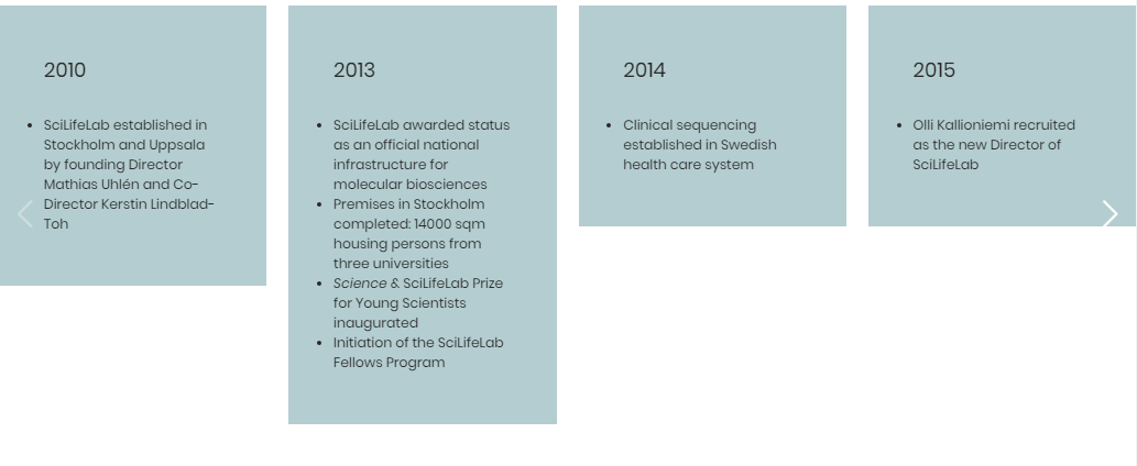
These are two seperate blocks used together on the site to create the milestones slider section (About us). They can both be used seperatly.
Card slides renders a slider of the child content. The slides can be swiped and dragged on both mobile & desktop.
Card for slider is just a card with background-color and some padding.
A box with icon, a title and a button. Used to link to other pages or external urls.
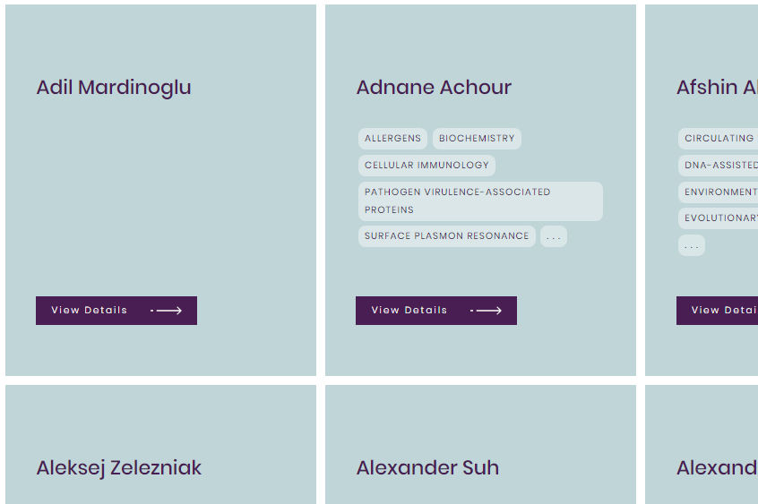
Used to generate grid of people. People is a content type used to store all people that should be showcased around the site.
When ‘Save Changes’ is pressed, the people will be fetched and a preview of the cards is seen. To update the content – the block and page needs to be saved again. (Blocks are saved as static content in the database.)
Videobox is a section that shows text on a background-video from Vimeo. An option to add a play button to play a full video in a popup. It can be used anywhere on a page, but also works great as a header!
It has an option to pick the height of the video as a % of the window height.
This is an engaging block, use it often!
[videopop]Colored box is a very simple block that renders a box with a set padding and a background color. Used to highlight parts of content.
Lorem ipsum dolor sit amet, consectetur adipiscing elit, sed do eiusmod tempor incididunt ut labore et dolore magna aliqua.
Header with links is a text only header section that is specially made to handle links. It is currently not used on the site.
3. Reusable blocks & dummy layouts – simplifying new content creation
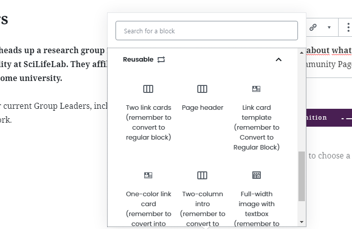
The reusable block allows you to save a block or group of blocks which you can later use in any post or page on your site. If you are often adding the same content to the same block or group of blocks, using the reusable block will save you a great chunk of time.
In order to ease the creation of pages we have saved reusable blocks for some common content sections. It is very important to remember to convert to regular block when using them.
A common way to start creating new content is to duplicate previously made pages and changing the content. We have utilized this method and created ‘Dummy pages’ that represent common page layouts. Duplicate these pages and get a jump start in creating new content! Below are links to the pages:
- Coming soon!
4. Using forms
The website uses ‘Formidable’ – plugin to create forms. To insert these forms into simply add the form shortcode into the ‘Shortcode’-block.

5. FAQ
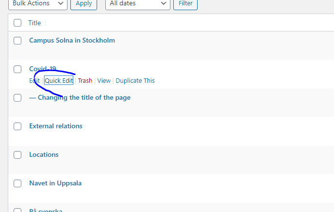
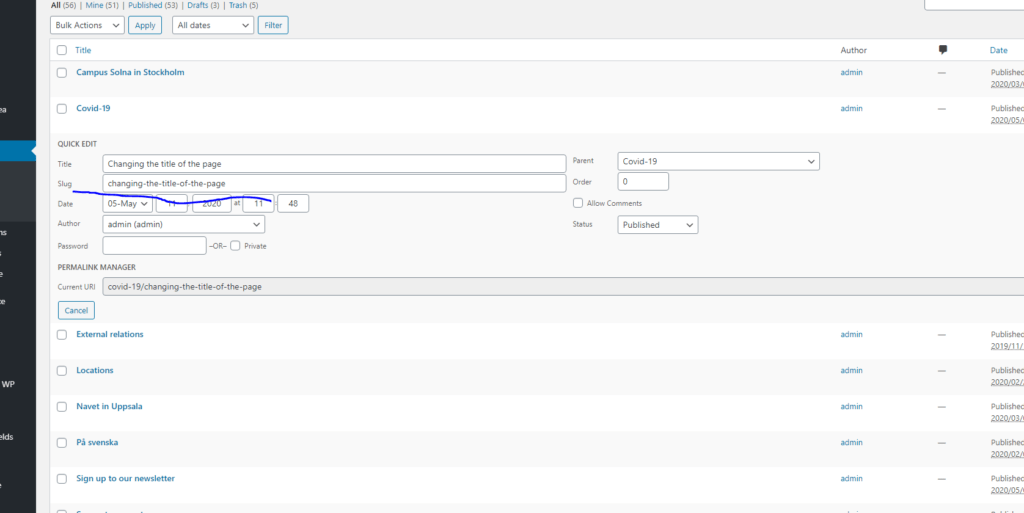
The news feed on the Covid-19 fetches all news articles that have been tagged with ‘covid19’. Tags can be added from ‘quick edit’ in news list or on document tab while editing.
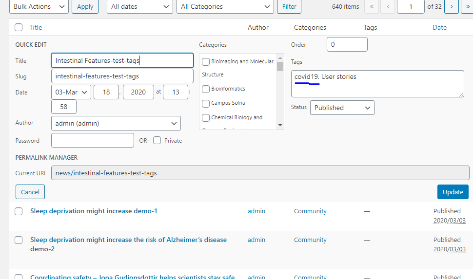
Use quick-edit!
Use the ‘Seperator‘-block. By using this block the site will have consistent spacing.
Most blocks are preset to add the page margin. However, since we sometimes want full-width content, we can not apply this to all blocks. To be certain to acheive page margins, use the ‘Content Container’-block under ‘SciLifeLab blocks’. This blocks sole purpose is to add the page margins to its inside content.
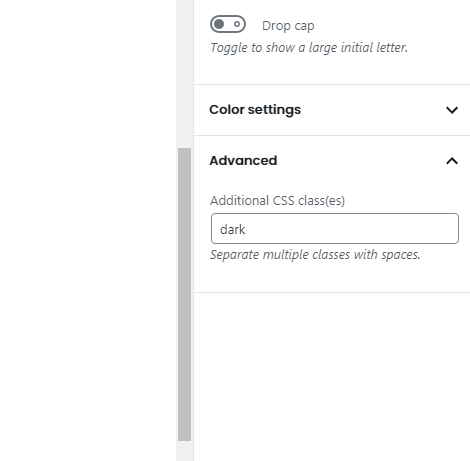
Select the Columns / Group / Content container that you wish to have the grey background and add dark under Advanced.
Add the class ‘green-link’ under adnvanced settings for the block.
Yes. You can add the class ‘hide-mobile’ to any block and it will not display on mobile devices.
6. For developers
Coming soon!