SciLifeLab launches new logotype
Today, SciLifeLab is launching a new logo – as one of several steps in renewing our look to reflect who we are and where we’re going. It also gives us a chance to communicate our brand in a more effective and cohesive way.
Since SciLifeLab launched in 2010, it’s been in constant growth. What started as a two separate research campuses in Stockholm and Uppsala, have grown into a government-commissioned national infrastructure, with equal access for all Swedish academic researchers. We’ve gone from occupying just a few floors in two buildings, to having over 1 300 affiliated researchers and 40 infrastructure units at a number of universities across Sweden.
Over the last decade, the scope of SciLifeLab has widened and developed, and that’s something we want our look to convey. And what better timing than during 2020, our 10-year anniversary?
A logo to stay with us, as we grow and communication channels develop

As you’ve probably noticed, several updates to SciLifeLab’s look have already been carried out during 2020, such as the new profile colors and the new website. And as of today, we’re launching the new logo. Designed to showcase the dynamic and frontline organization that SciLifeLab is, and the fast pace at which we’re constantly moving forward. A logo to stay with us as we continue to grow and develop.
On today’s communications platforms, with various channels and formats and a steady stream of information, our logo needs to be distinctive and easy to use. It should be unique and difficult to replicate, easy to incorporate in different layouts and adjust to 1:1 requirements and other formats. It should also help us communicate a clear and cohesive brand experience across channels. And as these needs weren’t completely fulfilled by our previous logo, we’re thrilled to announce this update.
Inspiration and symbolics incorporated in the symbol
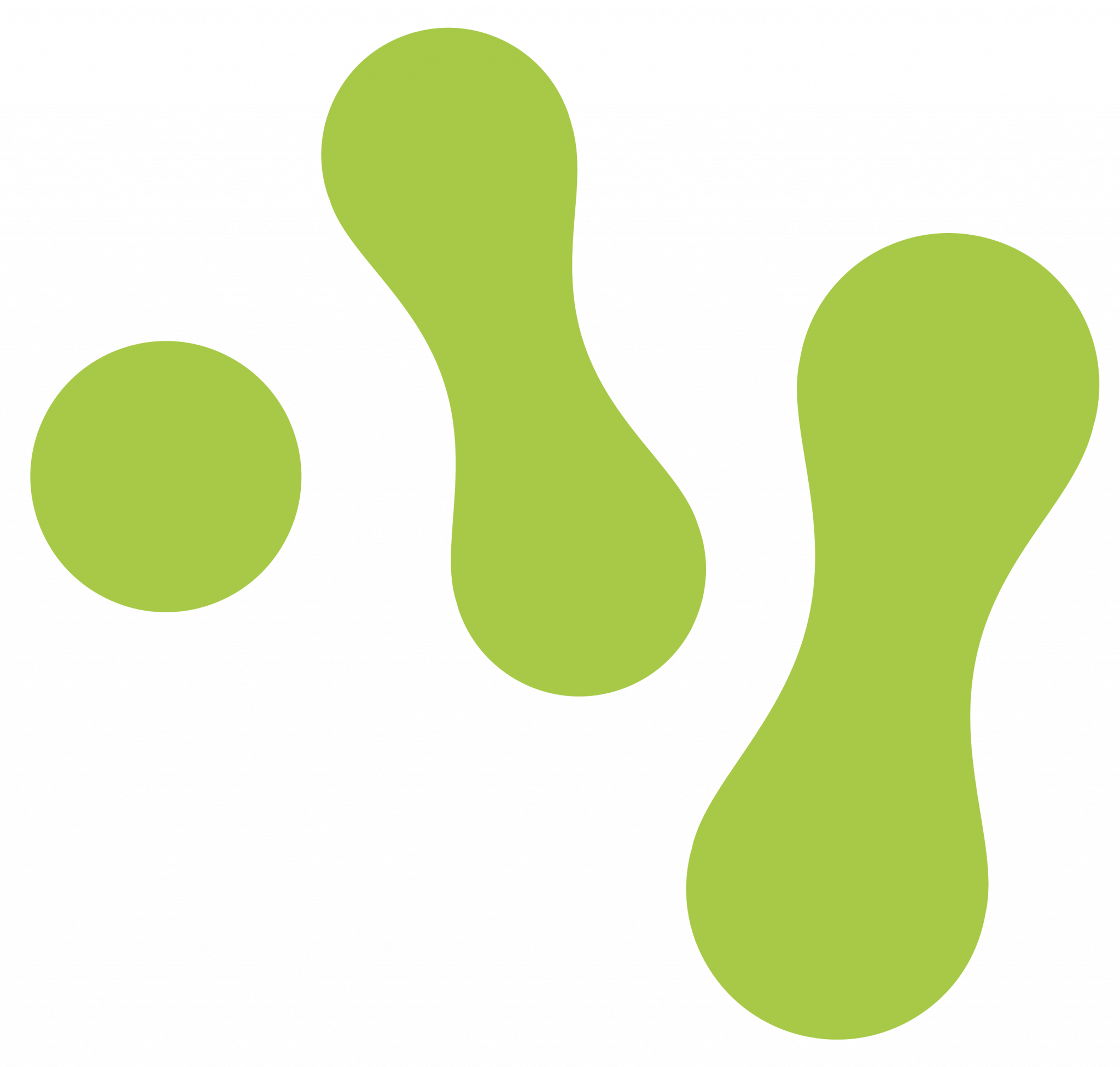
Having taken inspiration from a number of objects – for instance organelles, the growth of an ecosystem, cell division, foot prints, and the action of putting puzzle pieces together – the symbol is meant to lend itself to a number of associations and be interpreted in the eye of the beholder. What do you see?
Read more
Want to hear more about the process of developing the new logo? Head over to our Community Pages!